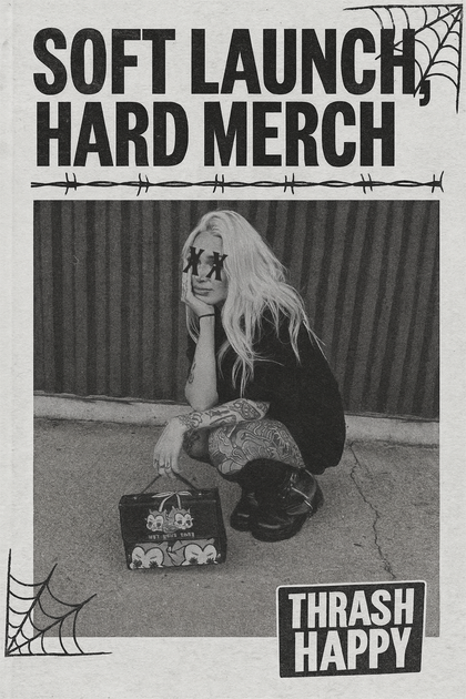
A hannya-mask thong, a sacred-heart handbag, a barbed-wire hat chain — every piece in Thrash Happy's catalog is loud by design. The question isn't whether the graphic works; it's how to wear it so the outfit reads as your taste rather than a costume. This article lays out five styling rules drawn from published fashion-editor frameworks + visual-perception theory. Educational — not fashion-industry consultation.
Rule 1: One loud piece per outfit — the focal-point rule
Per Rudolf Arnheim's Art and Visual Perception (the foundational text on figure-ground balance), a visual composition needs one dominant focal point for the eye to land on. More than one and the eye bounces; no focal point and it drifts.
Applied to an outfit with a Thrash Happy piece:
- If the thong or panty is the loud piece (visible waistband on low-rise pants, peek-through mesh dress), everything else should be neutral — plain jeans, plain tee, solid color.
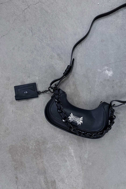
- If the handbag is the loud piece (Sacred Heart, Tattoo Flash, 13 Traditional), the rest of the outfit goes quiet — simple dress, plain shoes, minimal jewelry.
- If the graphic tee or hoodie is the loud piece (All Killer No Filler, Stealth Camo), simple bottoms, plain hat or no hat, neutral shoes.
Two loud Thrash Happy pieces in one outfit is the classic alt-styling mistake. It reads as a theme outfit, not a daily wardrobe. Save the second loud piece for tomorrow.
Rule 2: Neutral base — the contrast rule
Per Who What Wear's styling-editor columns (and Vogue's statement-piece guide), loud graphics need a visually simple base to read as intentional. The base should be:
- Solid colors or tonal neutrals (black, white, grey, cream, washed denim, muted khaki).
- Clean silhouettes (straight-leg jeans, simple dress, plain tee, crew sweater). Not baggy-oversize + graphics — too much visual noise.
- Fitted where the graphic piece is loose, or loose where the graphic piece is fitted. Visual rhythm.
Example outfit with a Tramp Stamp gym short: solid black cropped tank + plain white sneakers + single gold chain necklace. The short is the focal point; everything else gets out of its way.
Rule 3: Confidence scaled to occasion — the context rule
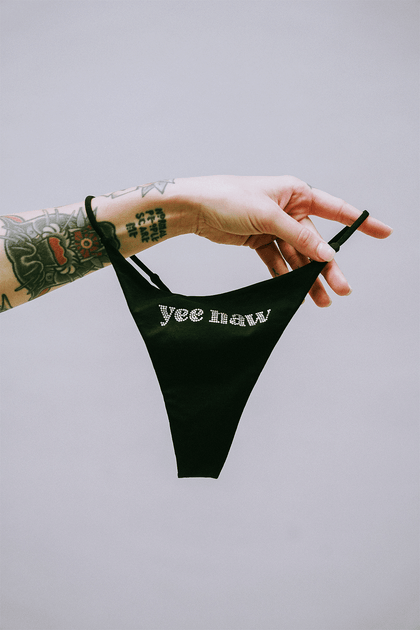
A hannya-mask thong reads differently at a house party, at work, at a wedding, or at your grandmother's Sunday dinner. This isn't a moral judgment — it's just audience math. Styling for audience:
| Context | Loud piece placement | Readable to whom |
|---|---|---|
| House party, bar, concert | Graphic visible — tee, hoodie, handbag, peek-through | Peers who speak the visual language |
| Casual daytime | Graphic on accessory — hat, bag, charm, sunglasses | You + the specific people you make eye contact with |
| Work / professional | Graphic underneath — panties, thong, socks | You only. A private detail. |
| Formal / family / high-stakes | Skip. Wear Silverlyne instead. | The setting isn't for this vocabulary. |
This is not censorship — it's styling awareness. The graphics carry subcultural weight. Placing them where the subculture is recognized produces connection. Placing them where it isn't produces discomfort without the pay-off.
Rule 4: Layer accessories — the stacking rule
Per Dazed Digital's coverage of Gen-Z alt-fashion, the current styling grammar rewards accessory stacking — multiple small pieces that build a look — over single-loud-piece drops. Thrash Happy's $5-$20 accessory tier (hat chains, charms, barbed wire hat attachments, Y2K chains) is specifically built for this.
Effective stacking combinations:
- Trucker hat + barbed-wire hat chain + Y2K hat chain = one headpiece reads as layered, not singular.
- Neutral handbag + Cloud 9 + Dummy Gummy + Lil Hex plush purse charms = one bag becomes a moving sculpture.
- Plain outfit + Old Skool sunglasses + Barbed Wire chain + one visible graphic underwear waistband = layered alt signal without costume feel.
Three small accessory stacks often read more stylish than one single loud piece — especially at work-casual or weekend-daytime contexts.
Rule 5: Tonal + graphic, not color chaos — the palette rule
Thrash Happy's graphics skew toward a specific palette: black ink, red, hot pink, camo, bone, white. Building outfits that respect this palette reads cleaner than mixing in unrelated colors:
- Black-and-red palette: Tramp Stamp gym short + black sports bra + red accent (socks or bag charm). All within the Thrash Happy color vocabulary.
- Bone-camo palette: Bone Camo shorts + bone tank + camo Stealth hoodie. Monochromatic within the brand.
- Pink statement: Nasty Rhinestone thong waistband peek + solid pink cropped tee + white denim. The pink echoes.
Where it breaks: pairing a Thrash Happy piece with lime-green shoes + teal bag + purple socks is visual chaos. Pick 2-3 colors that echo inside the outfit.
Five styling mistakes (common in tattoo-flash apparel)
- Two loud pieces at once. Hannya thong + Death Moth hoodie = costume. Pick one.
- Busy base. Plaid + graphics + texture = overloaded.
- Wrong context. "Make Boys Cry" underwear at grandma's = pick a different day to wear it.
- Fresh-out-the-box stiffness. Graphic tees look better worn-in. Wash 3-4 times before first wear, iron, soften. Brand-new stiffness reads as "just bought this."
- Un-tailored silhouettes. Oversized hoodie + oversized cargo + oversized hat = hiding. Fit one piece, float the other.
What actually matters (shortlist)
- One loud piece per outfit — the focal-point rule from visual-perception theory.
- Neutral base (solid colors, clean silhouettes) to let the loud piece read as intentional.
- Context awareness — graphic placement scaled to audience.
- Accessory stacking (charms, chains, hat attachments) reads more stylish than single loud pieces in many contexts.
- Tonal palette — pick 2-3 colors that echo. No chaos.
- Avoid the five common mistakes: 2 loud pieces, busy base, wrong context, stiff new-in-box feel, un-tailored silhouettes.
Related reading
- Tattoo flash, briefly — history of the visual language.
- Why small-batch independent brands matter — the economics.
Shop the sheet
- Tramp Stamp Gym Shorts
- Cloud 9 Purse Charm
- Holy Sunglasses
- Barbed Wire Hat Chain
- Full Thrash Happy catalog
References
- Vogue — How to Wear Statement Graphics (editor's guide) — Vogue (Condé Nast) (accessed 2026-04-24)
- Who What Wear — Statement Piece Styling + Neutral-Base Rule — Who What Wear (Clique Brands) (accessed 2026-04-24)
- Arnheim, Rudolf. Art and Visual Perception: A Psychology of the Creative Eye — University of California Press (accessed 2026-04-24)
- Dazed — Alt Fashion Now: Gen-Z Tattoo + Y2K Revival Coverage — Dazed (Dazed Media) (accessed 2026-04-24)
Discover more from Thrash Happy or browse the full Thrash Happy collection.
Frequently asked
What does "How to Style Tattoo-Flash Apparel — Without Looking Like You're Wearing a Costume" cover?
This piece walks through the topic, context, and practical implications laid out in the article body above — focused on giving you a clear, sourced read rather than a quick listicle. Use it to deepen your understanding of the brand, category, or product family discussed.
Who is this article written for?
Readers shopping the brand or category covered, plus curious browsers researching independent makers stocked at Curated Sense. Both casual shoppers and trade buyers will find the same source-linked perspective.
How does Curated Sense vet the brands featured in journal articles?
Every brand in our journal has been onboarded directly: live inventory sync with the brand's own catalog, links back to the maker's own .com, and quality checks against return-rate, fulfillment-time, and customer-message-volume thresholds. We don't run sponsored placements in our journals.
Where can I shop the products discussed in this article?
Open the brand's collection or sub-collection page linked above to see current stock. Each product card opens a full Curated Sense product page with sizing, materials, the maker's own description, and the brand's live shipping policy.